|
|
|
|
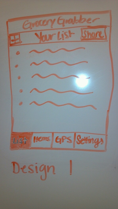
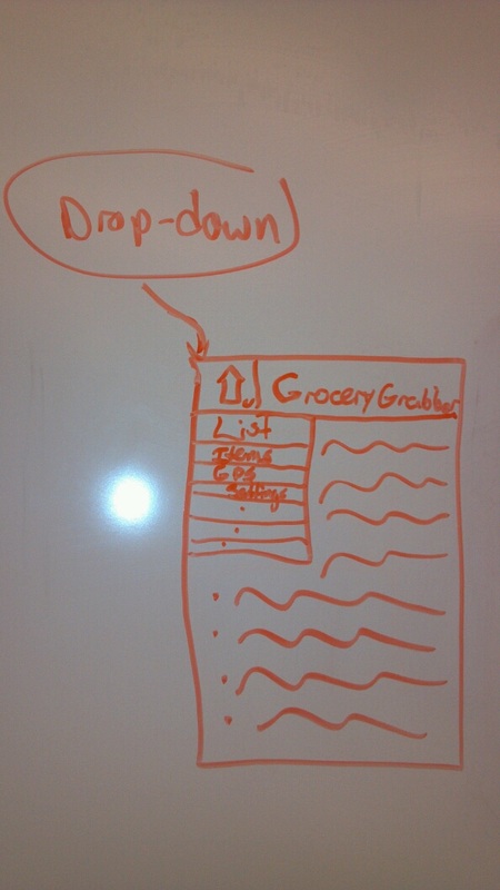
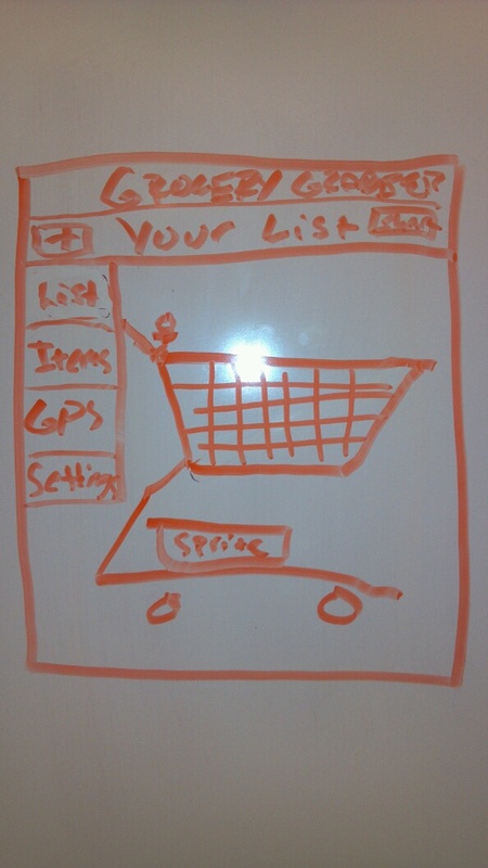
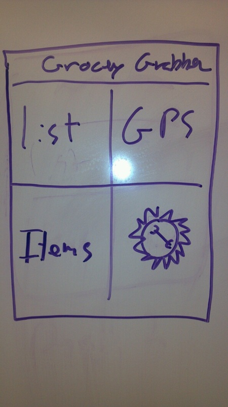
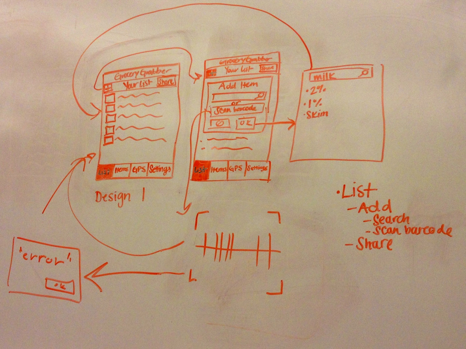
Rough Interfaces
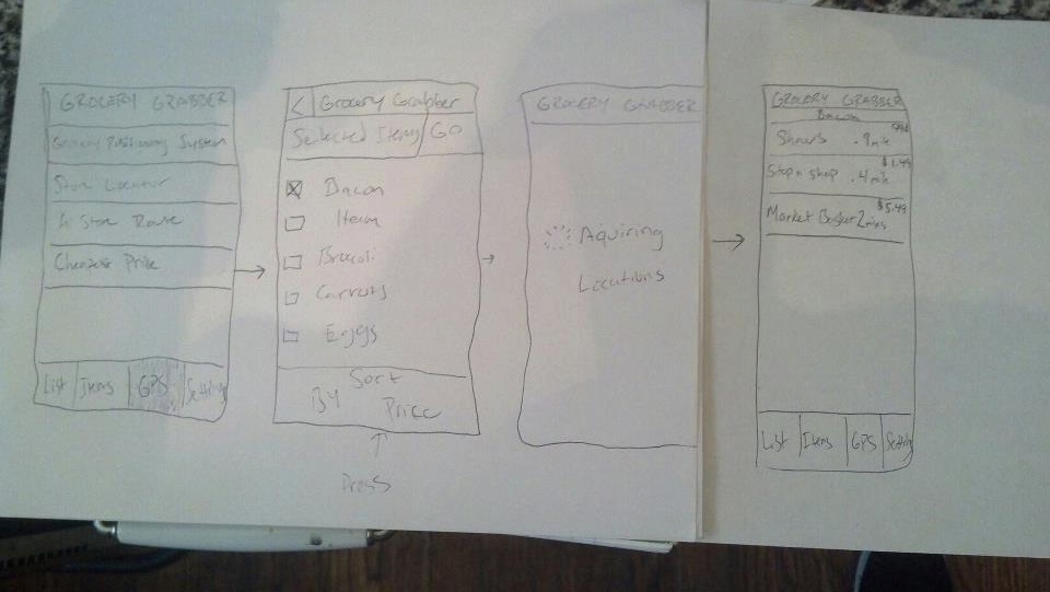
These are four of the rough interfaces that we have sketched. We eventually settled on the first image. While all of them provided the same list of items that we felt were necessary, we wanted something sleek and useful to the consumer ultimately. The third image provides a blank of space in the bottom left-hand corner, the second drops a menu that blocks a piece of the screen, the fourth is unnecessary because its flashy and users can use a small menu, so we felt the first worked best with the small menu bar in the bottom and the list as the homescreen.
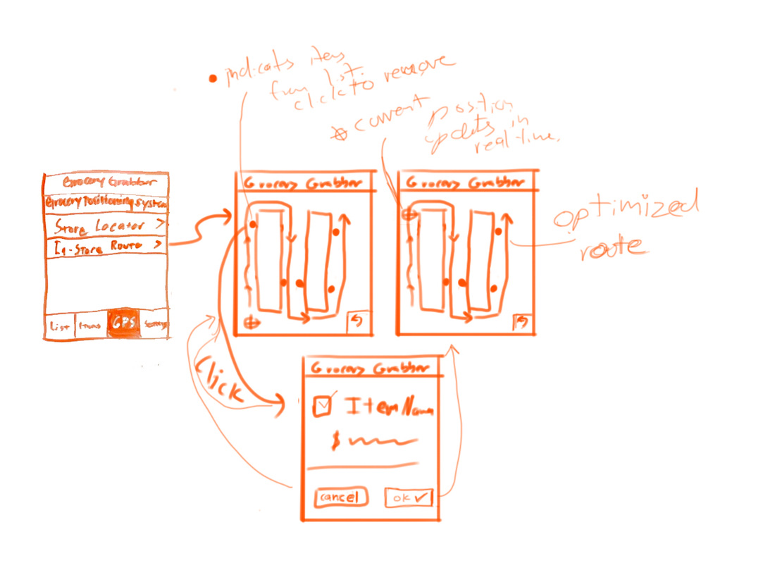
Add/Delete Storyboard
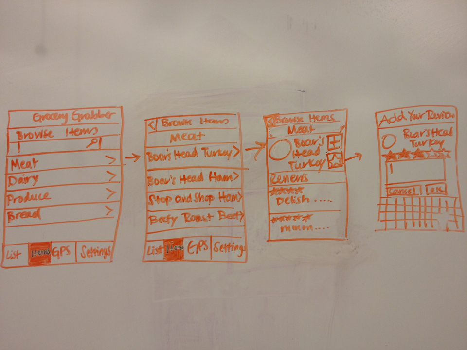
Searching Item/Ratings
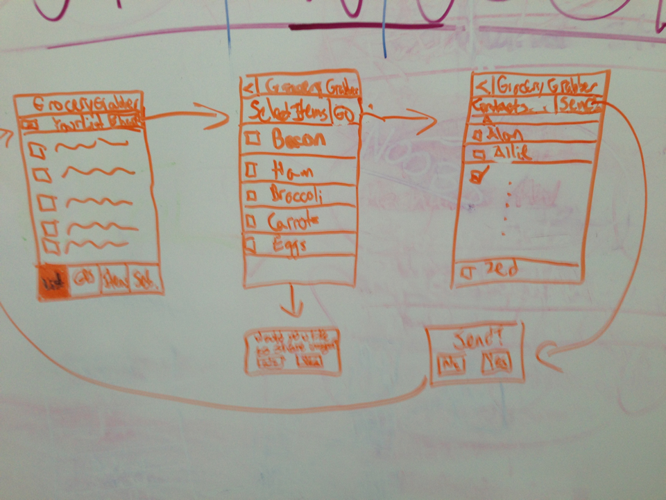
Sharing Your List
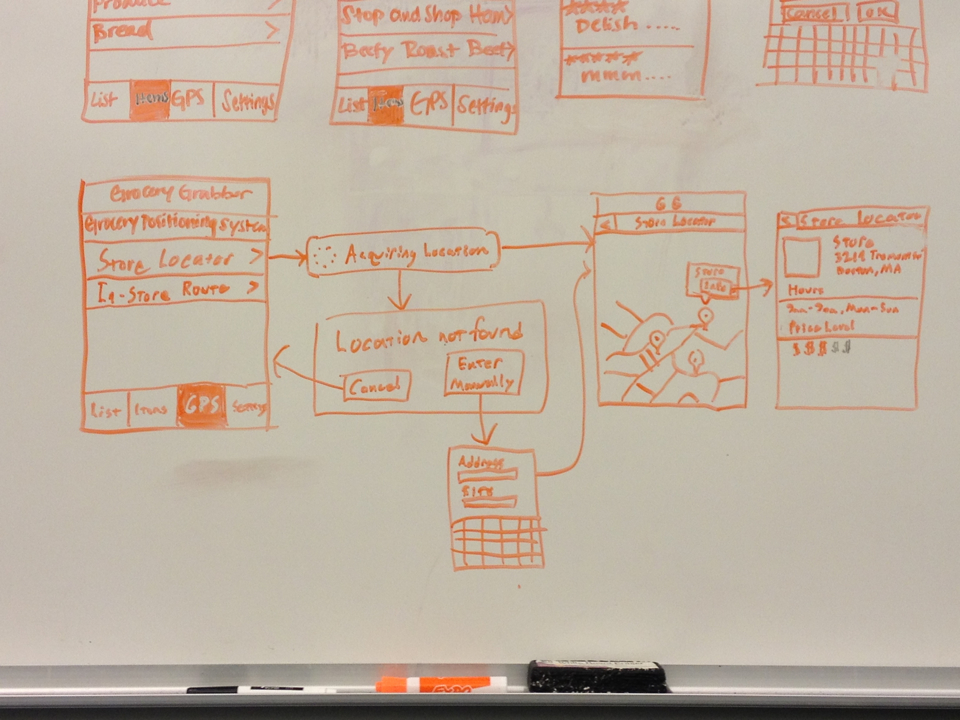
Finding Stores on the Map
Finding in store routes
Finding Cheapest Location
Team Roles
Everyone contributed to this assignment. Each person drew at least one diagram, and we all worked together towards finishing and perfecting the design choice. Matt placed the items on the website and delegated the assignment as well.
