User Testing In Action
Briefing
Hello, we are designing a new app for your mobile device that helps you to: compile a grocery list, find the cheapest price for an item between all the stores in your area, map out your route inside the store, give you directions to each store, and rate each product for others to review.
Informed consent: We are conducting a study that will help us see how we are doing developing our application. We will not use your name or any details about you. This is a quick survey using the paper versions of the application that we have provided. Your participation is not mandatory and you can stop at any time. We have candy, so if you help us out we will give you some candy.
This application has an extensive user interface that will help our users shop easily. The point is that we want to unify all stores together so that students will find it much easier to shop. We want it to be the best way to shop. This will include search bars, maps, and rating systems to help you out.
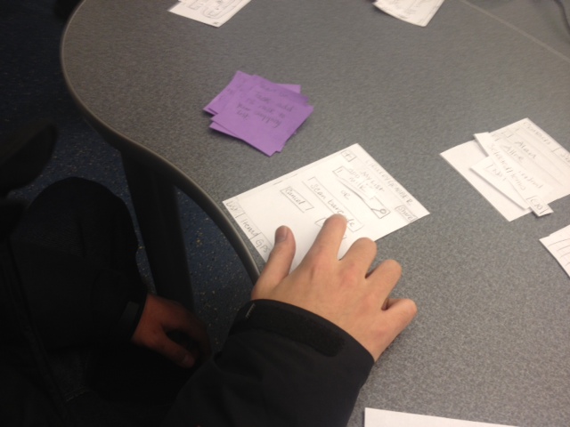
We have paper prototypes of our design. We do not have a concrete object with it yet. Seeing as we are testing this design, nothing that goes wrong is your fault. Please let us know of any issues you have during this experiment. It is something we should probably fix.
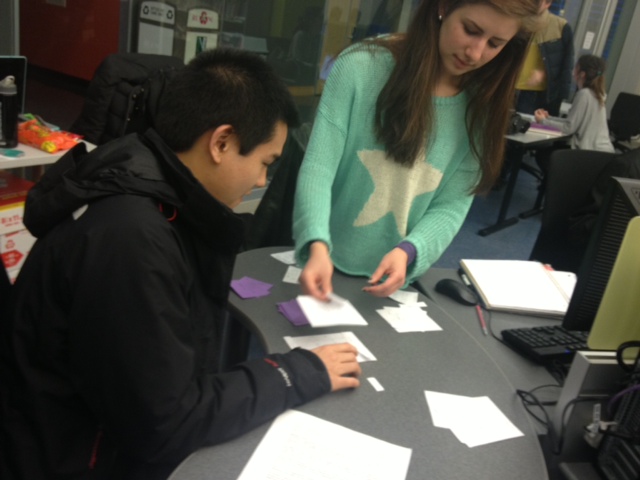
One of us will be playing the computer for you. We will be the system that you are interacting with while you are clicking buttons.
Let us know what you think would better this interface. You are our test user! Help out anyone else who will eventually be seeing this product. If you are confused, think it needs fixing, or want to pay us a compliment, speak up.
Your first task is awaiting you. Choose what you want to do if you agree to help us out.
Are you ready? Do you want candy? Go.
Informed consent: We are conducting a study that will help us see how we are doing developing our application. We will not use your name or any details about you. This is a quick survey using the paper versions of the application that we have provided. Your participation is not mandatory and you can stop at any time. We have candy, so if you help us out we will give you some candy.
This application has an extensive user interface that will help our users shop easily. The point is that we want to unify all stores together so that students will find it much easier to shop. We want it to be the best way to shop. This will include search bars, maps, and rating systems to help you out.
We have paper prototypes of our design. We do not have a concrete object with it yet. Seeing as we are testing this design, nothing that goes wrong is your fault. Please let us know of any issues you have during this experiment. It is something we should probably fix.
One of us will be playing the computer for you. We will be the system that you are interacting with while you are clicking buttons.
Let us know what you think would better this interface. You are our test user! Help out anyone else who will eventually be seeing this product. If you are confused, think it needs fixing, or want to pay us a compliment, speak up.
Your first task is awaiting you. Choose what you want to do if you agree to help us out.
Are you ready? Do you want candy? Go.
Scenario Tasks
Task 1 - Add 1% Milk to your shopping list.
Task 2 - Create a rating for Boar's Head Turkey
Task 3 - Share your grocery list with Allie
Task 4 - Find a store in your area.
Task 5 - Check off items as you find them in a store.
Task 6 - Find the store that has the cheapest priced bacon.
Task 2 - Create a rating for Boar's Head Turkey
Task 3 - Share your grocery list with Allie
Task 4 - Find a store in your area.
Task 5 - Check off items as you find them in a store.
Task 6 - Find the store that has the cheapest priced bacon.
Demographics
User 1 - 20 year old Asian computer science major in his second year.
User 2 - 20 year old Caucasian computer science major in her third year.
User 3 - 20 year old Caucasian computer science major in his second year.
User 2 - 20 year old Caucasian computer science major in her third year.
User 3 - 20 year old Caucasian computer science major in his second year.
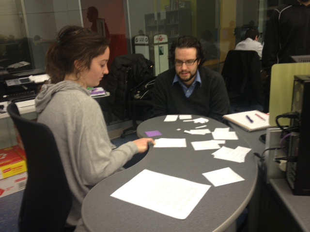
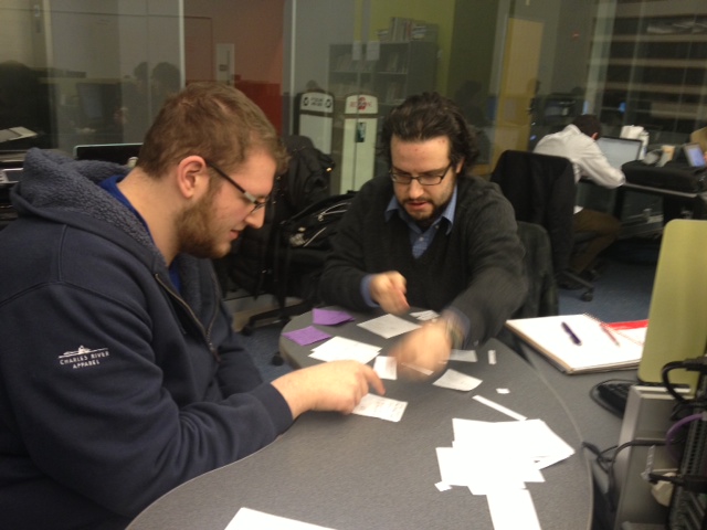
Observations
User 1
hitting 'add' is pretty intuitive at least
wow, so is the star button for reviews, cool
sharing with Allie went okay
should have made 'uncool store' info
task description for 'checking off items' is unclear
make instructions bigger, people need to know they can tick things off from the in-store route without going to the items page
consolidate our gps screens actually
User 2
user 2 has claimed that item rating is not intuitive, and the button should be 'browse' instead of 'items'. User 1 did not have trouble with this, so I think we need a 3rd opinion.
"select all button" would be helpful, she says (I agree)
yes we get it you want a browse button and a home button
Navigating through a store is still unclear
She went back to the items screen
(no not cheapest price by store)
She didn't know she was in a store
She says the things on our home need to be a little bit more clear
She didn't think to go to GPS
The home page would not come up from the gps page
It doesn't make sense that you would go to GPS to find out where you can find the cheapest price for bacon
User 3
Everything turns out better than expected
Even in-store routing
Font issues will be fixed in the final release, hopefully that makes it sort-by-price more obvious.
Feedback from users
Feedback 1: It was pretty straightforward, for the most part. The task where I was going through the supermarket was hard. Instead of having the instructions at the top, have them be a box that pops up where you have to hit 'okay'. The way I was doing it, I ended up hitting a lot of buttons.
Feedback 2: Make the core goals of our app more clear, make the home screen have more useful things on it, items should be changed to browse (we know), there should be a 'select all'.
Feedback 3: Have a "Send Entire List" button (i.e. select all). Selecting items should have more than dots, and a quantity in case you have to buy more than one of those items. That's it.
Results
Overall the testing showed that most of our design worked well. The most consistent problems were with the mapping functions, especially knowing what/where they were . We discussed the need for a better home screen that displays the available actions better, instead of just the shopping list with buttons on the bottom. Also we are going to add a 'select all' button in several places where it might be more convenient than manually checking off a lot of items in a list.
Roles
We all made parts of the interface prototype, although Carly made several sections. We each performed as the computer for the sections of the prototype we made. Matt couldn't make it to our user testing section, but he wrote the briefing doc. Arash set up the page for our post, and liam took most of the notes directly to it. We each added our notes and comments afterword.
